Introduction
A color space is a specific mathematical model that organizes and represents colors as tuples of numbers, most often as three or four values. But why do we need multiple color spaces? color is not a fixed physical property; it is a perception generated by our visual system when light interacts with objects. Digital devices—screens, cameras, scanners, printers—all produce and capture color using fundamentally different physical principles: screens emit light, printers use inks that absorb light, and our eyes have three types of color‑sensitive cone cells.
A color space provides the essential bridge between these worlds. It allows us to describe a color numerically so that it can be communicated, stored, and reproduced consistently across different devices (a process known as color management). Moreover, different color spaces are designed with different goals in mind: some mirror the way hardware works (RGB, CMYK), others align with how humans naturally describe and manipulate color (HSV), and still others are perceptually uniform so that measured color differences match what we actually see (LAB). Without color spaces, digital imaging, printing, and computer vision would be chaotic and device‑dependent, making it impossible to guarantee that a photo looks the same on your screen as it does in print or to design algorithms that “see” color the way we do.
Early computers were created to solve mathematical problems such as calculations or to build networks (for example, for time sharing and synchronization). As computers evolved into entertainment tools and software development advanced, data visualization became increasingly important. The first monitors could only display two colors: black and white. Later, with more memory, faster processors, and higher bandwidth, more resources were dedicated to showing richer images. However, the way we humans talk about color is fuzzy. We say “light red” or “dark purple”, but that raises questions: how light is that red? What mixture of red and blue makes a particular purple? Such descriptions are subjective and cannot be directly used by machines. A color space solves this by assigning precise numeric coordinates to every reproducible color.
As different peripheral devices appeared—especially printers of various types—the problem became more urgent. A monitor creates color by mixing red, green, and blue light, but a printer creates it by layering cyan, magenta, yellow, and black inks on paper. The same digital color values can look very different on these two kinds of devices unless a proper color model translates between them. Furthermore, early computers had limited processing power and memory, so handling multiple color conversions or storing full‑color images was a significant overhead. The table below illustrates how even a simple black‑and‑white image can be represented with different color depths, and how clever processing can stretch limited resources.

|
|
| A | |
|
|
|
|
B |
C |
|
|
|
|
D |
E |




Fig.1 shows an image represented with different color depths and different post‑processing. Image A is assumed to be a real‑world input that we want to show using only 1‑bit and 2‑bit palettes, with two types of rendering. Fig.1.B is a simple bi‑level (black/white) version created by thresholding—it uses only two colors, 1 and 0. Fig.1.C also uses only black and white, but it seems to contain more shades because it employs a technique called dithering, which tricks the eye into seeing intermediate tones through patterns of dots. By comparing Fig.1.B and Fig.1.C you can notice more shadow and texture detail in the dithered version. When we use two bits per pixel (quad thresholding), we can store four distinct gray levels, as shown in Fig.1.D. Applying dithering to this 2‑bit palette (Fig.1.E) further improves the perceived quality. This demonstrates how the choice of color space and bit depth, combined with smart processing, directly affects the memory needed and the final appearance of an image. color spaces define what those numeric values mean, making it possible to design such compression and dithering algorithms.
As hinted earlier, different devices rely on different color spaces because of their physical nature, cost, and performance constraints. For example, mixing red and blue light on a screen yields a bright magenta, but overlaying red and blue inks on paper usually gives a muddy brown, not a vivid purple. This is one reason the CMYK model was created for printing. Even a simple black‑and‑white document is cheaper to print with a dedicated black ink than by mixing cyan, magenta, and yellow every time.
RGB
RGB is arguably the most famous color space. It is an additive model, meaning colors are created by combining red, green, and blue light. This choice is not arbitrary—it is directly inspired by human vision. Our eyes have two main types of photoreceptor cells: rods and cones. Rods are highly sensitive and responsible for vision in low light; they only detect brightness, not color. Cones work under normal lighting and give us color vision. There are three kinds of cones, each most sensitive to a different range of wavelengths: roughly corresponding to red, green, and blue.
|
|
|


Fig.2 illustrates the two cell types. Rods contribute only to luminance perception, while cones—sensitive to short (S, blue), medium (M, green), and long (L, red) wavelengths—enable color discrimination. Because we have these three cone types, any color can be approximately matched by a combination of three primary light sources. That is the essence of the RGB model.
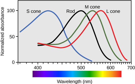
Fig.3. Spectral sensitivity of the three cone types and the rod cells [3]
Fig.3 plots the sensitivity curves of the S, M, and L cones, along with the rod response. You can see that their ranges overlap significantly, which is why certain color mixtures can sometimes be perceived differently depending on lighting conditions.
The RGB color space capitalises on this trichromatic vision to build an intuitive and hardware‑friendly model. In an additive system, starting from black (no light), adding red, green, and blue at varying intensities produces a wide gamut of colors—full intensity of all three yields white. That is exactly how modern displays work: every pixel on an LCD or OLED screen is made of tiny red, green, and blue subpixels. By controlling the intensity of each subpixel, the screen can recreate millions of distinct colors. Representing color as an (R, G, B) triplet is therefore incredibly efficient; the numbers map directly to the voltages driving the subpixels. This close relationship to physical hardware makes RGB the native color space of virtually all digital cameras, scanners, computer monitors, and image file formats (JPEG, PNG, GIF, etc.). Web colors are expressed in hexadecimal RGB, and almost every programming library for graphics uses RGB as its default.
Why is RGB so well‑known and handy? First, its connection to human cone cells makes it biologically intuitive. Second, its simplicity—just three numbers, usually integers from 0 to 255 per channel—makes it easy to store, transmit, and manipulate. Simple arithmetic lets you brighten an image (add to all channels), adjust white balance, or apply filters. Because it is the standard “language” of screens, you can share an RGB image and be confident that any modern display will interpret it directly. Although different devices may have slightly different primaries (leading to variants like sRGB, Adobe RGB, or DCI‑P3), the fundamental concept remains the same. Its main drawback is that RGB does not separate luminance from chromaticity and is not perceptually uniform—changing the green channel by 10 units does not produce the same perceived color shift as changing the blue channel by 10 units. This is why other color spaces were developed for tasks like color selection, image processing, and printing.
HSV
Humans do not naturally think of colors as mixtures of red, green, and blue. When you shop for a shirt, you do not tell the seller your favourite color in terms of R, G, B percentages. You talk about the type of color (hue), how vivid it is (saturation), and how light or dark it is (value/brightness). The HSV (Hue, Saturation, Value) color space was designed to match this human‑centric description. In RGB, the color and intensity information are completely intertwined; altering any one channel changes both the perceived hue and the brightness. This makes color‑based processing (like building a color histogram or segmenting an object by its hue) very noisy and difficult. HSV separates chromatic information (Hue and Saturation) from intensity (Value), making such tasks far simpler and more robust.
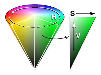
Fig.4. HSV cone [4]
Fig.4 shows the HSV model as a cone. Its components are:
- Hue: The color type (e.g., red, green, blue, yellow). It is represented as an angle around a central axis, typically ranging from 0° to 360° (sometimes normalised to 0–100%). Tracking the hue arrow in order gives: yellow → green → cyan → blue → magenta → red → yellow.
- Saturation: The vividness or purity of the color. It ranges from 0% (a shade of gray, completely desaturated) to 100% (the pure hue). Desaturation is the opposite—adding grey to the color. This aligns with the everyday notion of a “dull” vs. a “vibrant” color.
- Value (or Brightness): The intensity of the color, from 0% (black) to 100% (full brightness). This dimension stands apart from the chromatic information, which is extremely useful: you can change the brightness of an image without altering the hues.[5]
Because of this separation, HSV is a favourite in color pickers, image editing software, and computer vision applications where you want to track an object based solely on its hue, regardless of shadows or highlights. For instance, a red ball looks red in both bright and dim light; in HSV space, its hue remains relatively constant while only the value changes.
LAB
The LAB (CIELAB) color space was designed to be perceptually uniform, meaning that equal numerical changes anywhere in the space correspond to roughly equal perceived color differences. It is also device‑independent: LAB describes color as it is actually seen, not as a particular device produces it. This makes it the central profile connection space in color management systems; when converting from an RGB monitor to a CMYK printer, the image is usually transformed into LAB first, then into the printer’s color space. LAB consists of three components:
- L* : Lightness (intensity), from 0 (black) to 100 (diffuse white).
- a* : Green–red axis; negative values indicate green, positive values indicate red.
- b* : Blue–yellow axis; negative values indicate blue, positive values indicate yellow.
Unlike HSV, which uses a single hue dimension, LAB uses two opponent color axes (red‑green and blue‑yellow). This structure is far closer to the way our visual cortex encodes color, making LAB perceptually linear. That is why many professional applications, such as Adobe Photoshop, support it as an editing space. When we need to measure color differences precisely (for example, quality control of paints or textiles), the ΔE (delta E) metric computed in LAB is the industry standard.
In terms of practical image processing, LAB often outperforms RGB and HSV when the task must mimic human judgement. Consider the problem of detecting anthracnose disease in a leaf:
|
A |
|
B |
|
C |
|
D |

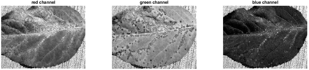


Fig.5 shows the original leaf (A) and its decomposition into individual channels for RGB (B), HSV (C), and LAB (D). The infected spots are brown. To automatically separate healthy and infected areas using a simple histogram‑based threshold, we need a color space where the diseased regions stand out significantly from the green leaf. Looking at the decomposed channels, you can see that in the RGB decomposition the difference is not very clean; in HSV, some separation appears but still mixed; in LAB, however, the infected spots are remarkably distinct, especially in the a* channel (green–red axis). The brown spots shift towards red, producing a strong positive a* value, while the healthy leaf tissue stays negative (green). This clear separation makes segmentation straightforward. This example illustrates why perceptually aligned color spaces like LAB are so powerful for machine vision tasks.
CMYK
CMYK is a subtractive color model used primarily in color printing. It stands for Cyan, Magenta, Yellow, and Key (Black). While screens start with black and add light, printing starts with white paper and subtracts brightness by applying inks. Each ink absorbs certain wavelengths: cyan ink absorbs red light, magenta absorbs green, and yellow absorbs blue. In theory, mixing cyan, magenta, and yellow in equal amounts should absorb all light and produce black. In practice, real inks are imperfect and the result is a murky dark brown. Additionally, using three layers of ink to create black text or fine details would be wasteful, slow to dry, and could cause registration problems. That is why a separate black ink (Key, K) is included. Black ink is cheaper, gives crisp, dense blacks, and allows for better shadow detail.
 |
|
A |
|
 |
 |
B |
C |
Fig.6 demonstrates the advantage of the K channel. Part A is the original image we want to reproduce. Part B shows the color separations using only CMY (no black). All dark and neutral tones are built by overlaying high percentages of cyan, magenta, and yellow, resulting in heavy ink coverage and often a brownish cast. Part C shows the same image separated with maximum black replacement (CMYK). The dark areas are now largely printed with black ink, while CMY inks are used mainly where color is needed. You can see that the white (unprinted) areas of each channel are much larger, meaning less ink is used overall. This reduces costs, speeds up drying, and yields sharper, more neutral grays and deeper blacks. The CMYK model is device‑dependent—the exact color you get depends on the printer, ink set, and paper—but it is the universal language of offset and digital color printing.
Resources
- https://en.wikipedia.org/wiki/List_of_video_game_console_palettes
- https://www.pinterest.com/zpqu/eye/
- https://courses.lumenlearning.com/wm-biology2/chapter/transduction-of-light/
- https://datacadamia.com/color/hsv
- https://ja.wikipedia.org/wiki/HSV%E8%89%B2%E7%A9%BA%E9%96%93
- https://arborjet.com/2019/03/25/anthracnose-what-are-the-symptoms-and-the-best-treatment/
- https://en.wikipedia.org/wiki/CMYK_color_model