Data visualization is an important skill in math, machine learning, or almost any scientific subject. There is as a proof, an image worth more than thousands words.

You can realize trend or behavior of data and its variation from data visualizations. In this short article, we’ll discus 12 different types of chart:

  • line
  • fill between
  • stack
  • scatter 2D
  • bar
  • histogram
  • stem
  • step
  • pie
  • scatter 3D
  • surf
  • contour

We write codes in order that avoid overwriting. In precise words, we use data generated from previous lines of codes and alter as it is necessary:

import numpy as np
from matplotlib import pyplot as plt
from os import path
save_dir = '/home/babak/Documents/web site/visualization'

We begin by importing our required packages. Install the packages if you don’t have them. Also “save_dir” is defined as a variable for saving directory. Remaining codes are about providing sample data, showing them, and save the graph. You can avoid saving graphs by removing or commenting one line before “plt.show”, I mean plt.savefig(…).

codegraph
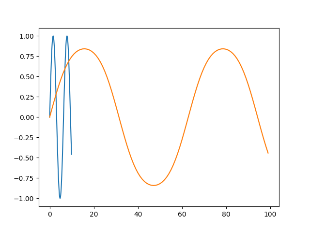
# line
x = [0.1*x for x in range(0,100)]
y = np.sin(x)
z = np.sin(y)

plt.plot(x, y, z)
plt.savefig(path.join(save_dir, 'line.png'))
plt.show()
line
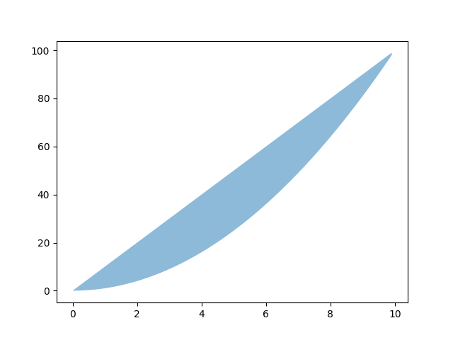
# fill between
y1 = [pow(i, 2) for i in x]
y2 = [i*10 for i in x]
plt.fill_between(x, y1, y2, alpha=.5, linewidth=0)
plt.savefig(path.join(save_dir, "fill_between.png"))
plt.show()
fill between
# stack
y3 = [pow(2, i) for i in x]
y4 = np.vstack([y1, y2, y3])

plt.stackplot(x, y4)
plt.savefig(path.join(save_dir, "stack.png"))
stack
# scatter 2D
plt.scatter(x, y)
plt.savefig(path.join(save_dir, "scatter_2d.png"))
plt.show()
scatter 2d
# bar
x = ['1980', '2000', '2020']
y = [10, 20, 30]

plt.bar(x, y)
plt.savefig(path.join(save_dir, "bar.png"))
plt.show()
bar
# histogram
x = [1, 2, 3, 1, 3]

plt.hist(x)
plt.savefig(path.join(save_dir, "histogram.png"))
plt.show()
histogram
# stem
x = [1, 2, 3, 4]
y = [2, 3, 2, 10]

plt.stem(x, y)
plt.savefig(path.join(save_dir, "stem.png"))
plt.show()
stem
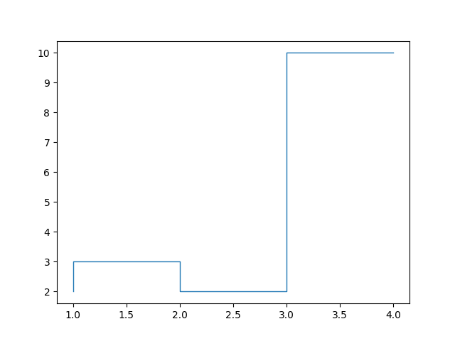
# step
plt.step(x, y, linewidth=1)
plt.savefig(path.join(save_dir, "step.png"))
plt.show()
step
# pie
labels = ['Africa', 'Europe', 'Asia', 'America']

plt.pie(x, labels=labels)
plt.savefig(path.join(save_dir, "pie.png"))
plt.show()
pie
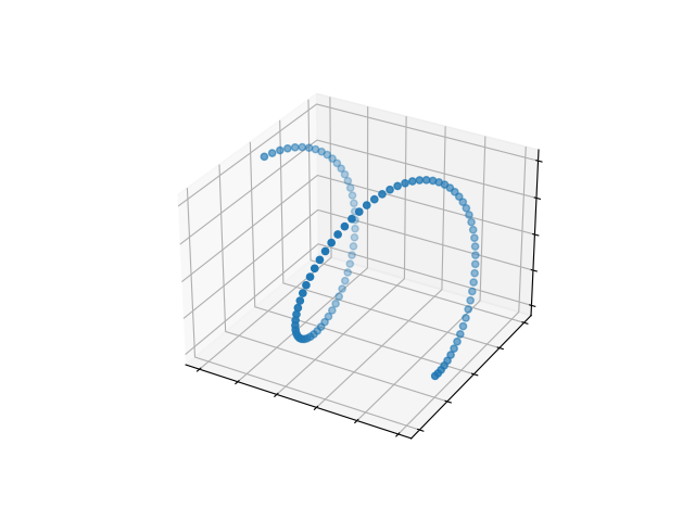
# scatter 3D
x = [0.1*i for i in range(0, 100)]
y = np.sin(x)
z = np.cos(x)

fig, ax = plt.subplots(subplot_kw={"projection": "3d"})
ax.scatter(x, y, z)
ax.set(xticklabels=[],
       yticklabels=[],
       zticklabels=[])
plt.savefig(path.join(save_dir, "scatter_3d.png"))
plt.show()
scatter 3d
# surf
x = 0.8*np.arange(-10, 10, 0.1)
y = 0.8*np.arange(-10, 10, 0.1)
x, y = np.meshgrid(x, y)
r = np.sqrt(x**2 + y**2)
z = np.arctan(r)

fig, ax = plt.subplots(subplot_kw={"projection": "3d"})
ax.plot_surface(x, y, z, vmin=z.min() * 2)
ax.set(xticklabels=[],
       yticklabels=[],
       zticklabels=[])
plt.savefig(path.join(save_dir, "surf.png"))
plt.show()
surf
# contour
levels = np.linspace(z.min(), z.max(), 10)
fig, ax = plt.subplots()
ax.contourf(x, y, z, levels=levels)
plt.savefig(path.join(save_dir, "contour.png"))
plt.show()
contour

We showed different type of graphs, for more information you should read matplotlib library documentations. Whole code can be found in my repo.